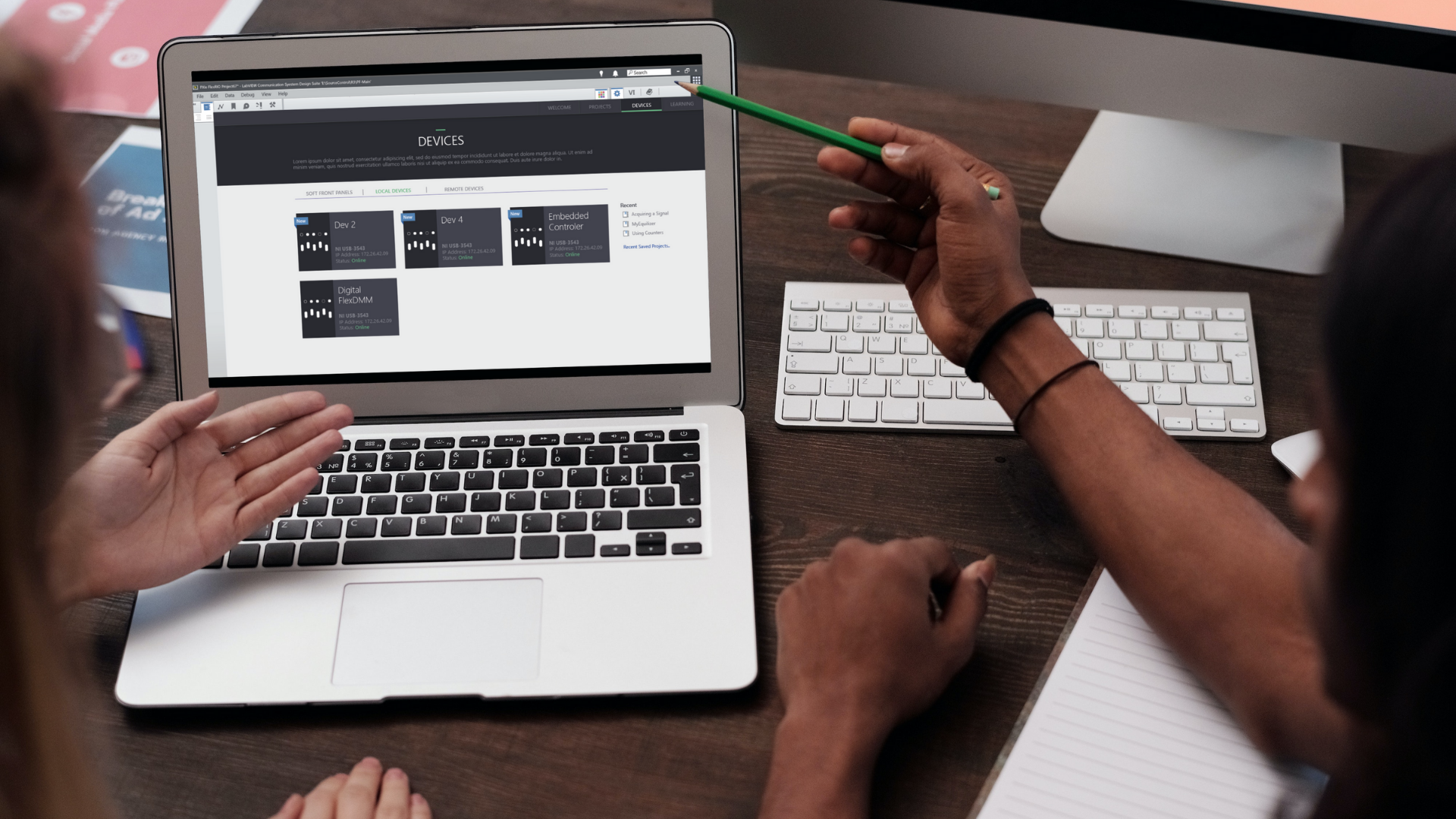
NI LabVIEW Device Navigation
My most significant project I undertook at National Instruments, a forefront provider of hardware and software solutions for engineers and scientists, was a redesign of the interface of LabVIEW. LabVIEW is the flagship software facilitating hardware system design, testing, and deployment. With the objective of enhancing the user experience this project effected the core software of the company.
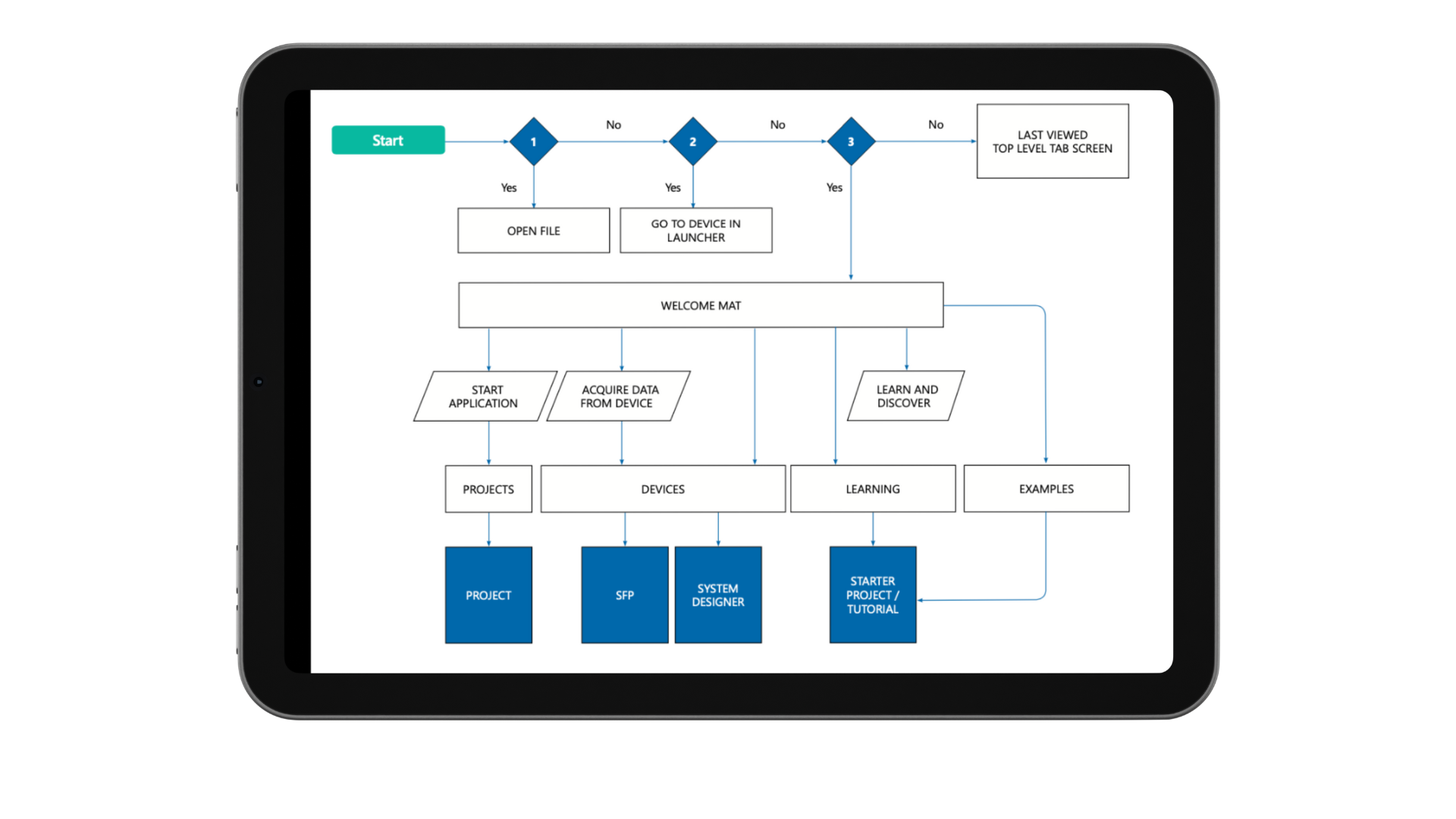
The project involved meticulous attention to detail, aiming to streamline the process of locating hardware devices and initiating data acquisition seamlessly. Below, I present key design segments that encapsulate the strategic approach and outcomes of this project.
User Research and Journey Map
We conducted user interviews on our campus as well as at our conference NI Week, an annual event with over 5000 of our users attending, to gain insights into our user’s challenges with our current interface. LabVIEW has existed since 1986, which means we had a large and dedicated user base to pull insights and concerns.
On opening LabVIEW, users found it difficult to locate their hardware devices to acquire data and/or start a project. Additionally, there was no clear distinction between different hardware types.
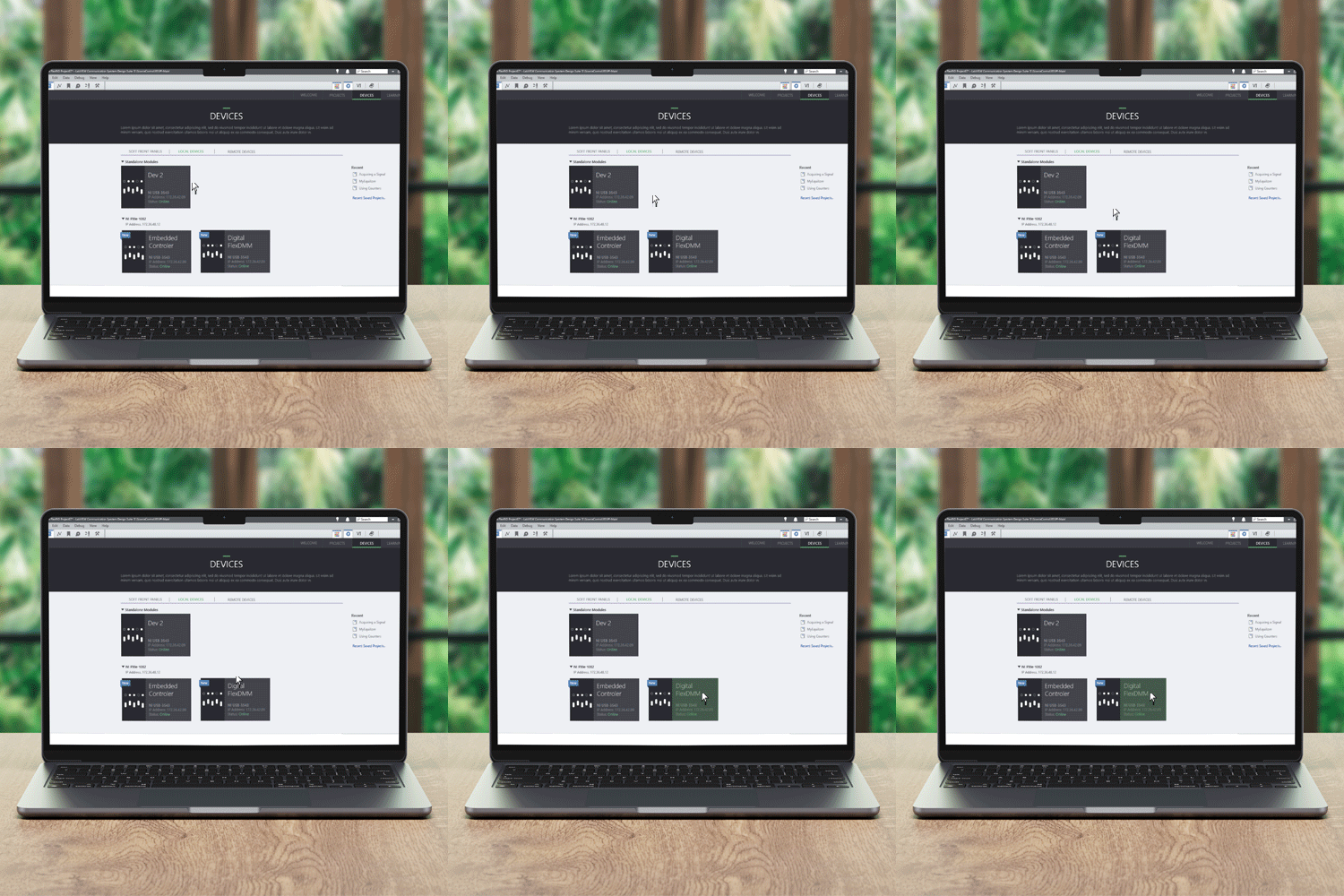
New Features: There was already a working prototype for users (see above). Based on user data we had been collecting at our conference NIWeek and campus research groups we knew the first new features we wanted to add across all hardware devices.
Pinning
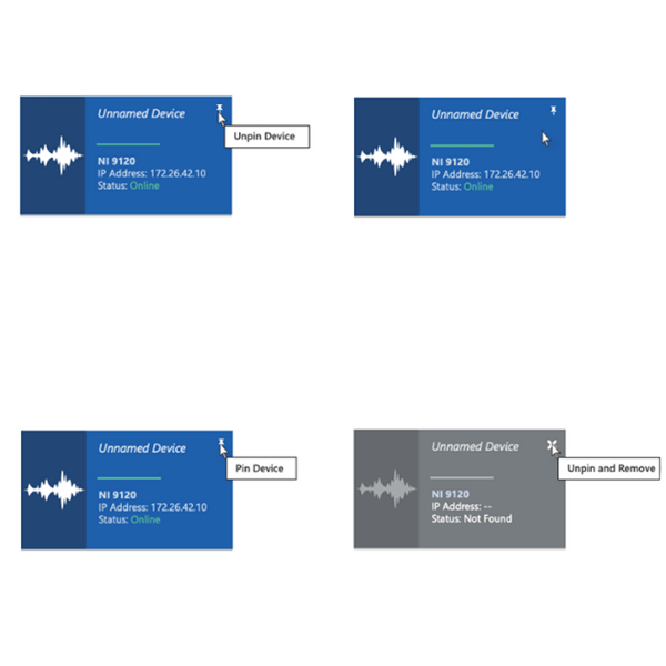
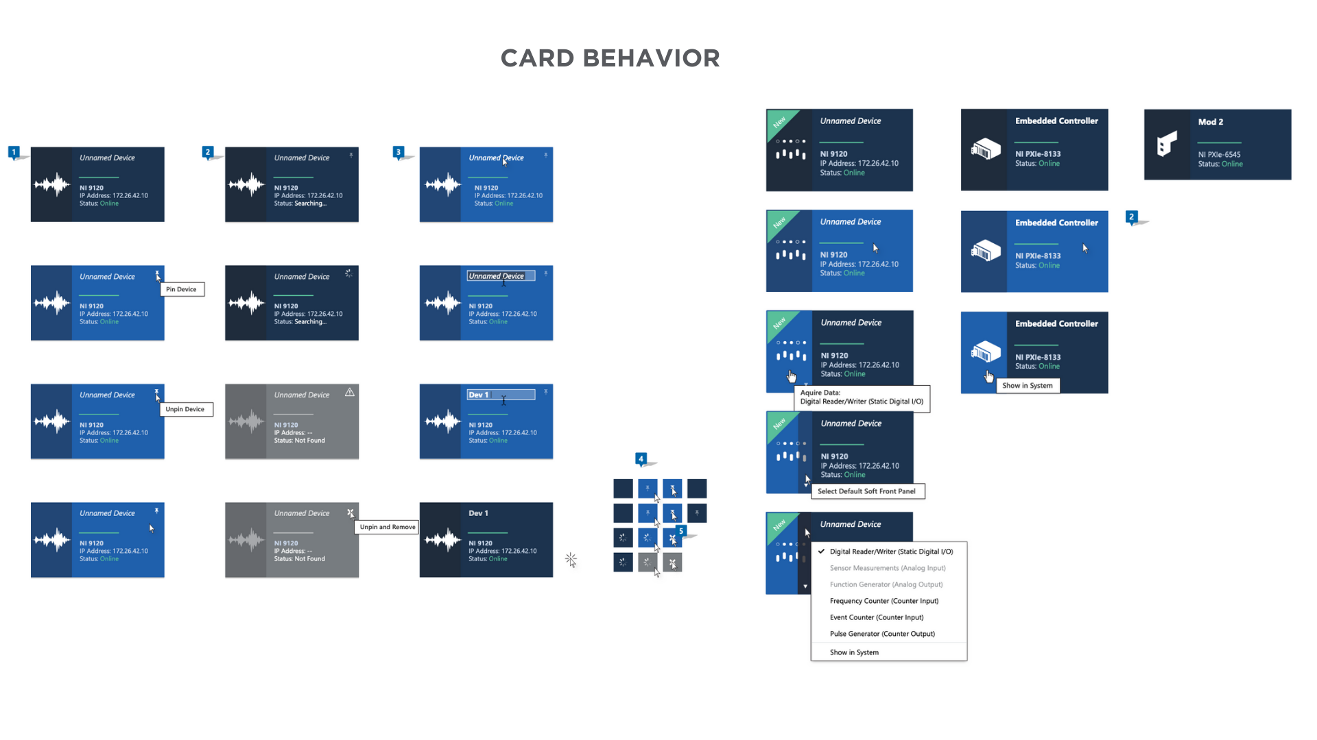
Unlike project items, pinning does not move a device or guarantee a position. Pinning is available for network devices only. Pinning requires that LabVIEW try to connect to that device on launch. Thi sis useful for situations where the devices may be on a separate domain and therefore not immediately discoverable.
2. New Device Icons
Notifications when a new device is found or connected. Used in tabs, subtabs, Chassis, and SFP Cards.
Soft Front Panel
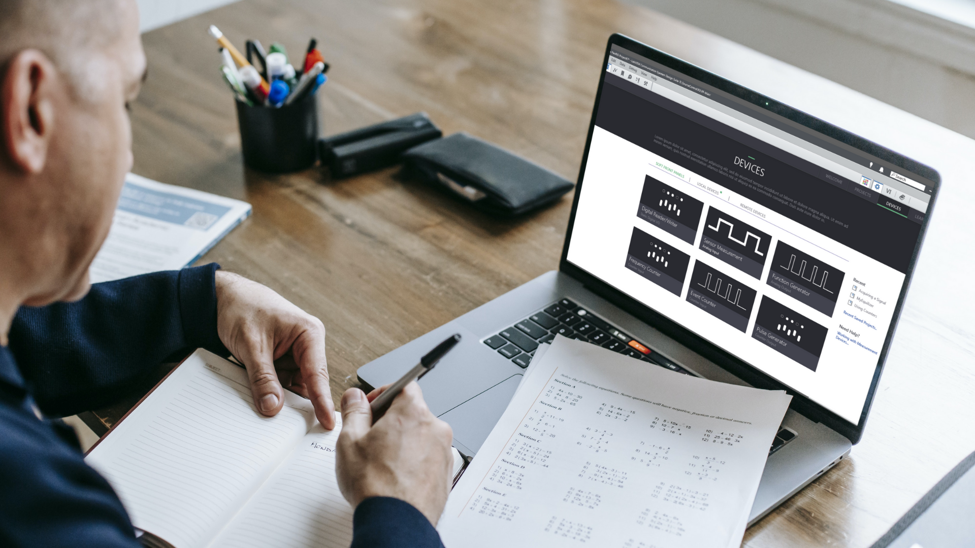
Soft Front Panel (SFP) devices are virtual instruments that mimic the functionality of a hardware device. They provide a software interface for controlling and monitoring the device, but they do not physically exist.
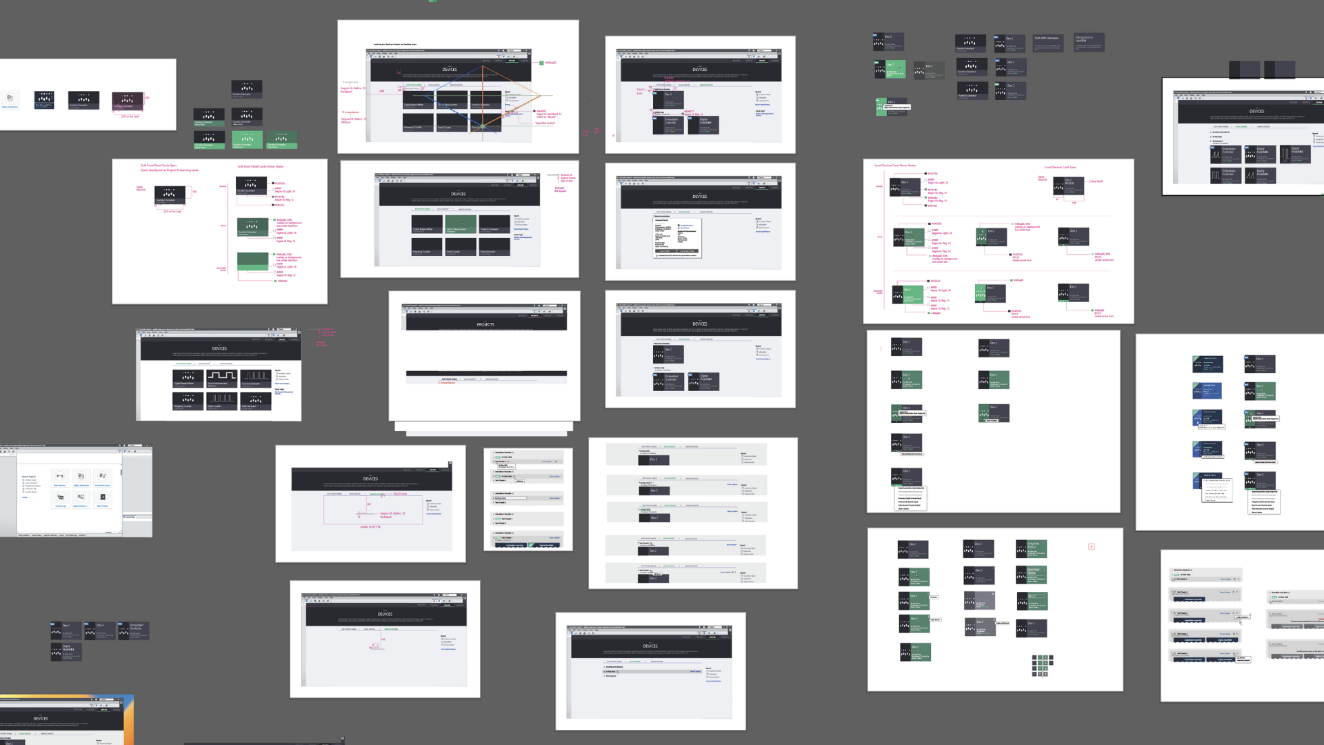
We already had wireframes from this project, so we moved straight into prototyping the features and navigation. We also outline the functionality of search here, how to open, etc
Usability Testing and Feedback
Once the interactive prototypes were ready, we conducted usability testing sessions with target users to gather feedback on the visual design, UI elements, and overall user experience. The insights obtained from these sessions helped us identify areas of improvement and refine the visual design iteratively. We iterated on the prototypes based on the feedback received and made necessary adjustments to enhance usability, address pain points, and align with user expectations.
We were able to work quickly to make lean changes based on the feedback we received and added a
Right Click Menu: The user can click anywhere on the SFP card to invoke the menu. On click, they can acquire data from a Device. Only devices that support that measurement and are available will appear in this list
Tool Tips: On-hover, if there is no device connected to support that measurement, or the required device is busy, the tooltip will let the user know the SFP is for configuration only. The user will see a similar warning on the SFP side once it has been launched.
Search Notification: LabVIEW should already be looking for devices before the user reaches this subtab, but if there are no devices found, there is a notification to the user that a search is in progress. If no devices are found, the search will be replaced with a ‘No Devices Detected’ message.
2. Local Devices
Local devices are LabVIEW-based hardware devices that are directly connected to a computer via a USB, Ethernet, or other interface. Local devices have physical connections to the computer and can be controlled and monitored using LabVIEW software.
Card Design
To streamline the access to local devices, we introduced a Local Devices card with three target areas:
Main Area Overlay: Clicking on the main area of the card would trigger an overlay, displaying detailed information and controls for the local device. This allowed users to quickly acquire data and perform necessary operations.
Left Side Functionality: The left side of the card provided direct access to the main function associated with the local device. This eliminated the need for users to navigate through multiple menus, enhancing efficiency and reducing cognitive load.
Main Function Selector: A button on the card allowed users to access a main function selector, which provided a comprehensive overview of all available functions and other hardware related to the local device. This feature empowered users to quickly switch between different functionalities without any Hassle.
Prototyping
We created a prototype to test with our users. Local Devices are physical hardware and had more extensive and complicated use cases for our users.
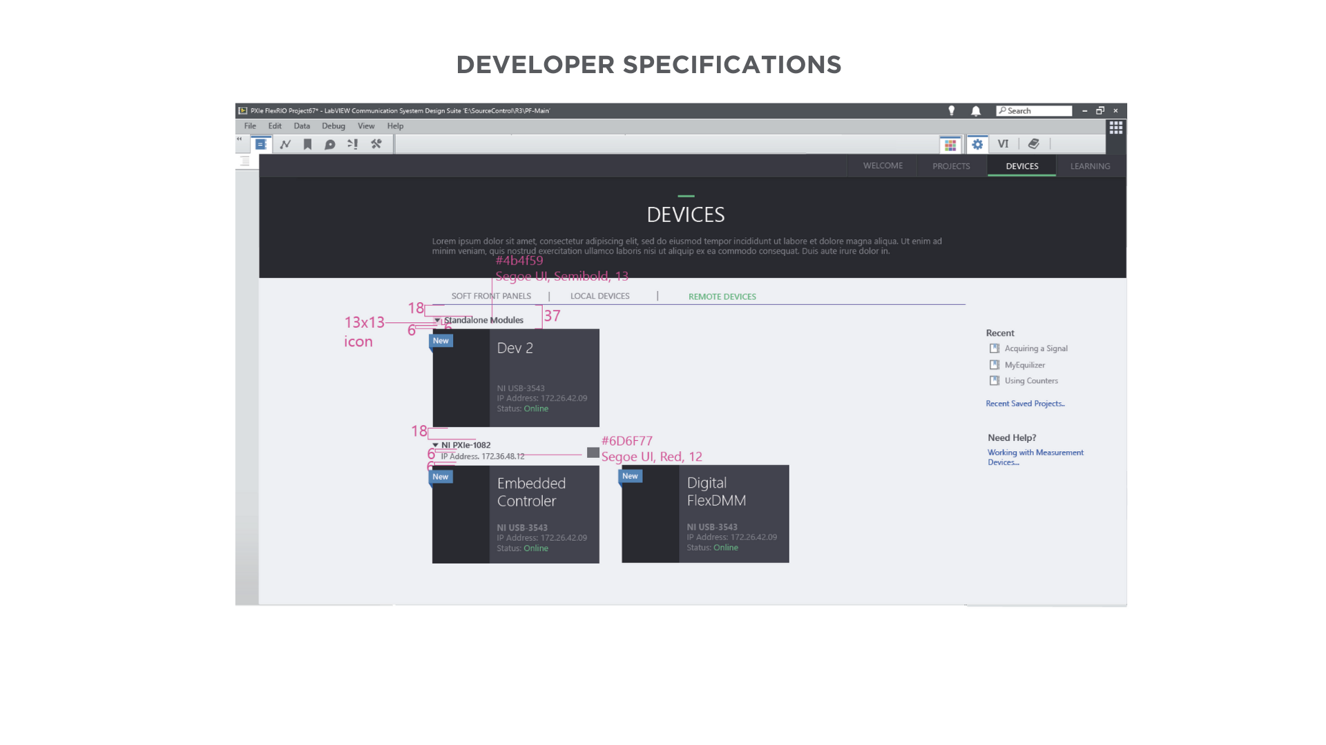
On testing this prototype, many users complained about the target area for the vertical button (main function selector) being too small, and some users never found it. After more user testing and visual iterations I landed on moving the button to the bottom of the card and making it horizontal to the card. The triangular “New” flag was also taking up too much space on the graphic so I made it slimmer and less obtrusive.
3. Chassis
Chassis are modular platforms that house multiple LabVIEW-based hardware devices, such as CompactDAQ, CompactRIO, or PXI systems. Chassis provides a flexible and scalable solution for acquiring and analyzing data from sensors, instruments, and other sources.
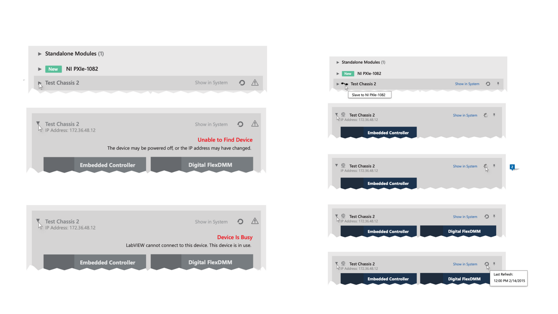
To improve the control over different hardware housed within the chassis, we designed a toggle system. This system enabled users to easily open and find specific hardware within the chassis. By simplifying the navigation process, users could locate and manage their hardware devices efficiently.
User Testing and Feedback
“New” alerts- I adapted the “New” flag to a version we could use on each Chassis section so users would see new devices without needing to open each section.
Errors-Users were having issues knowing if LabVIEW was searching for devices or if there were any problems. We added red text and glyphs to make this very obvious to users that they had a problem.
Solutions and Impact
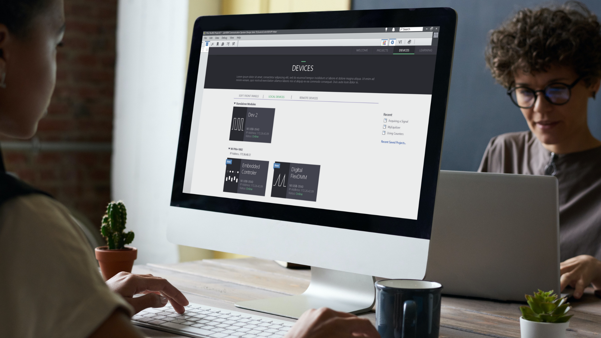
After weeks of iteration I and our team created a new Welcome Experience that tested very well with our users. I also received a promotion after this project based on my contributions and iterations.
The redesigned welcome experience for LabVIEW users achieved the following outcomes:
Improved Hardware Identification: The visually appealing cards with distinct graphics and copy helped users quickly identify and differentiate between their hardware devices. This reduced confusion and potential errors during data acquisition.
Enhanced Access to Local Devices: The Local Devices card, with its overlay, direct access to main functions, and main function selector, significantly streamlined the process of locating and accessing local devices. Users could acquire data faster and perform necessary operations more efficiently.
Simplified Chassis Management: The toggle system for managing different types of hardware within the chassis provided users with an intuitive and straightforward way to navigate and find specific devices. This improved overall control and saved time during hardware management.
Through this UX project, we successfully achieved the main goal of helping users quickly find their hardware, acquire data, and visually differentiate between their hardware devices. The redesigned welcome experience in LabVIEW not only improved user satisfaction but also enhanced their overall productivity and efficiency in using the software.


