NI LabVIEW Welcome Experience
Overview
Led a redesign of the LabVIEW welcome and onboarding experience, improving navigation, usability, and workflow clarity for technical users working with large datasets.
LabVIEW, a cornerstone in scientific and engineering realms, demanded a strategic overhaul. Users, dealing with substantial datasets, grappled with an outdated welcome experience and file navigation intricacies that had not had a design UI/UX update since the 1970's.
Key Project Details
Objective
Enhance the LabVIEW user journey by addressing the outdated welcome launch navigation, accommodating a diverse user base spanning Aerospace and Defense, Energy, Medical Devices, Academia, Manufacturing, Electronics, and Automotive. Clients include industry giants such as NASA, Boeing, Ford, and MIT.
Team
Orchestrating a cross-functional team consisting of 1 Interaction Lead, 2 UX Leads, 1 Visual Lead, 2 Developers, 1 Project Manager, 1 Marketing/Education specialist, 1 UX Sr. Lead Manager, and 1 IxD Group Manager.
Navigating challenges inherent in catering to such a diverse array of industries and use cases, the project aimed to create an intuitive and tailored welcome experience. With stakeholders now excited about the impactful changes we implemented, we set the stage for a more streamlined and user-friendly LabVIEW environment.
Primary Goals
- Help users more quickly open the software and be able to see what hardware devices were working and if it was acquiring data.
- Help users quickly navigate to existing projects and start new projects.
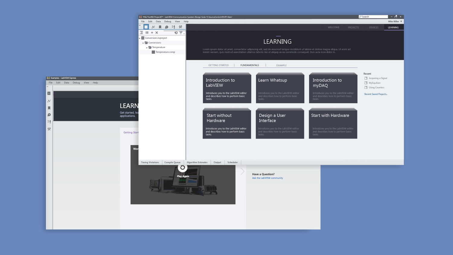
- Create a LabVIEW Learning center where new or novice users can easily learn about the program in a way that feels natural and efficient.
User Research & Journey Map
We conducted internal user research to understand how LabVIEW users currently navigate their files and what challenges they face. We also have decades of user feedback about what they would like to see. We worked with Managers from the Marketing, Education, and Developer teams to make sure those stakeholders' needs were also met.
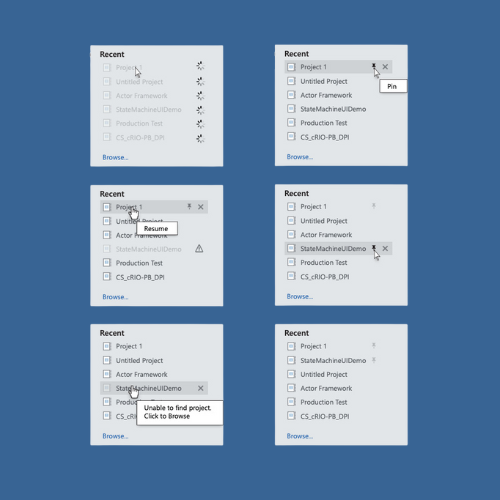
- Users work with large datasets, and file names are not always descriptive. Therefore, users often rely on thumbnail previews or other visual cues to identify files.
- Users have a hard time finding specific files because of the complex folder structures they use to organize their files.
- Users often need to switch between different projects and hardware seamlessly.
- Users need to be able to visually see what hardware is "on" and "off."
The Welcome Mat Concept
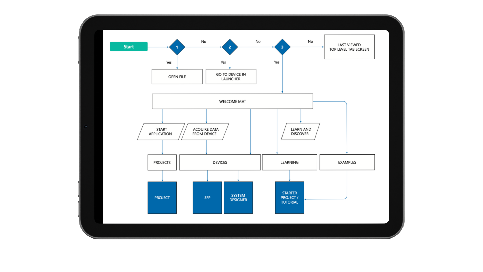
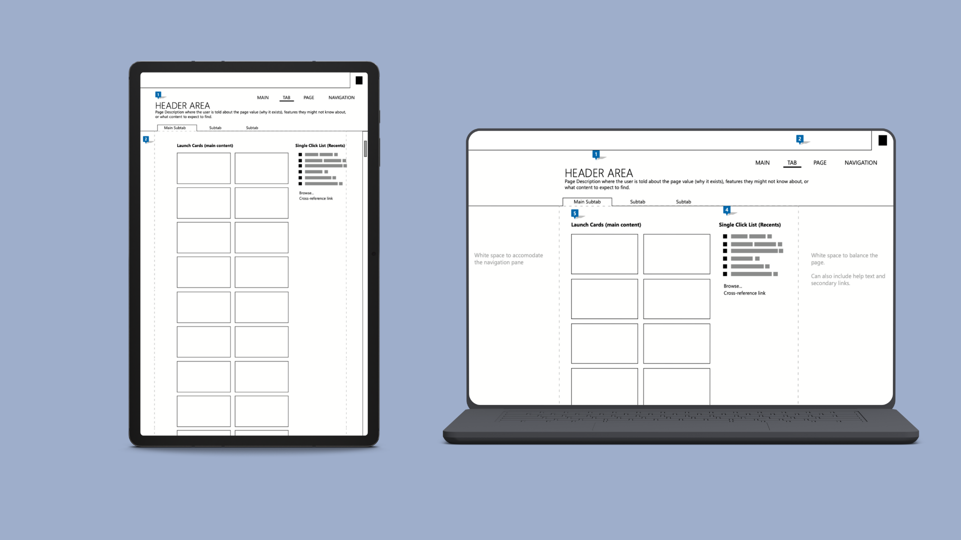
We defined 3 use cases of how someone launches the program and came up with the new concept of a "Welcome Mat" for them to land on.
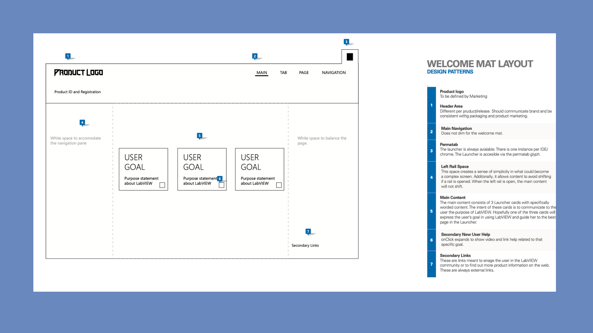
We went with a card-like system we called "Launch Cards" for projects as it would lend itself well to the hardware "devices" section when we go to that project down the road. These could either be categorical or leaf projects (starter projects, devices, tutorials, templates). Subtabs further organize the page, a main top left Nav, on the right a list of recent projects.
New Behaviors, New Design
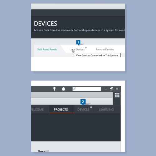
I worked directly with multiple stakeholders, and programmers to try and understand as many use cases before starting the Visual Design. We wouldn't start the hardware Devices tab for a few months but creating a holistic system that worked across all the ways our software was used was critical to me. How does a Local Device differ from Soft Front Panel Devices? What if a Device is offline? How do you acquire Data from a Device? How do you rename a New Chassis Device? What is a New Chassis Device?
I began designing for multiple use cases with the cross functional help of multiple teams so that later down the road we were not stuck in a Design System that was not informed.
Solution
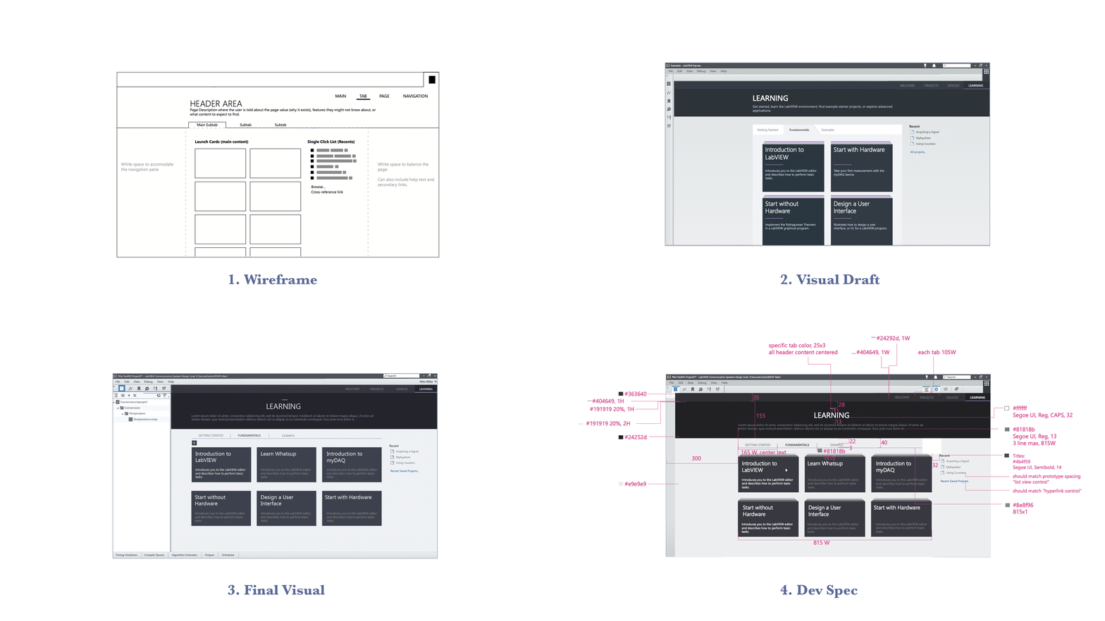
I used a very thorough system to deliver high-fidelity mock-ups and specs to engineering. All layout surfaces were checked and aligned to the pixel to deliver the cleanest in-OS experience possible. This is an essential part of ensuring the design is accurately translated into code, creating a consistent and cohesive user experience, and establishing clear communication between me and the developers.
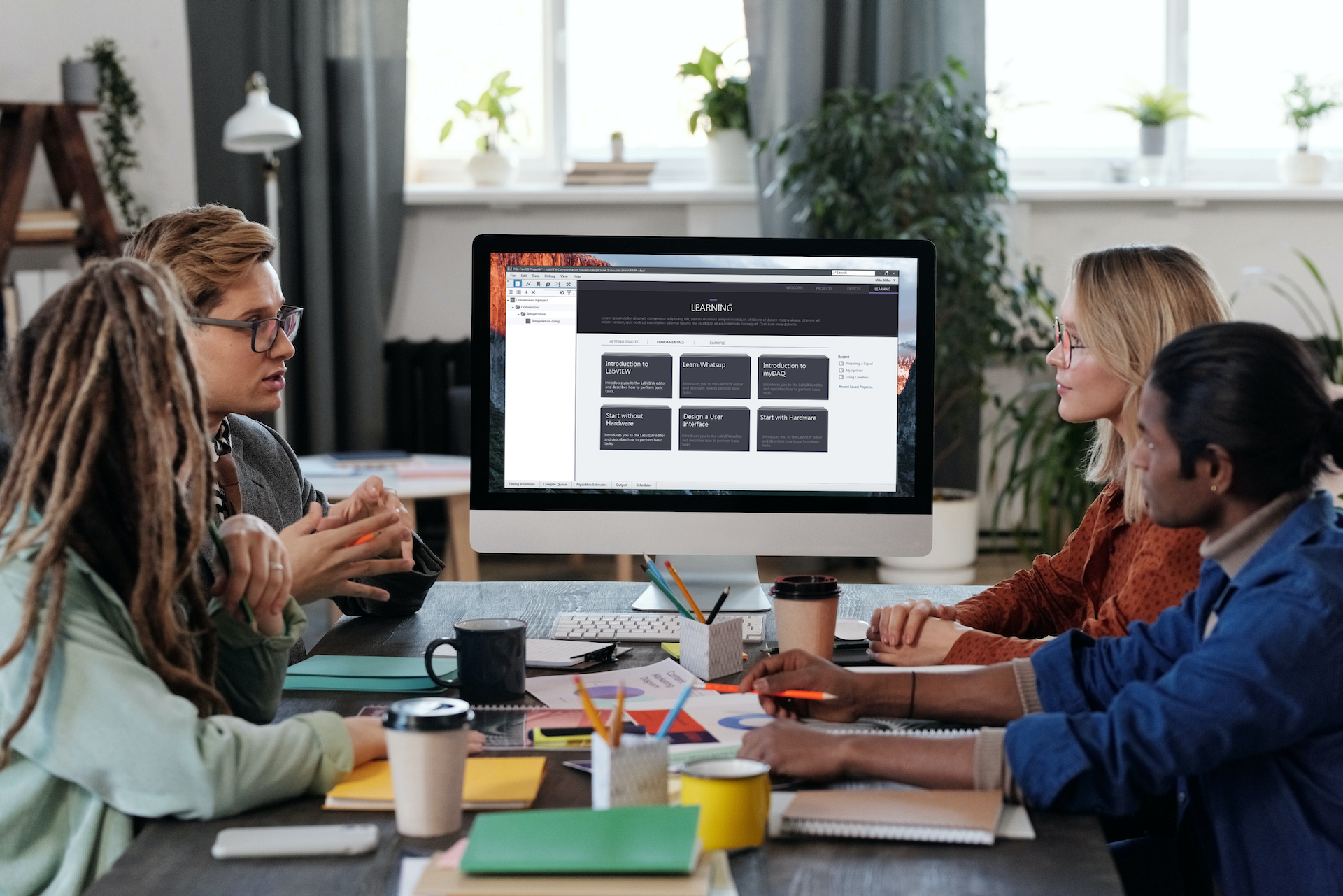
After months of collaboration, the Launcher was complete. The final solution is a collective cross-team effort based on insights from user research. We designed a welcome experience, file management system, and learning center that focuses on visual cues to create a richer experience and that would allow our company to add more robust features in the future to help our customers do what they do best, build something great.
Next Project